FMP – Final Garment
The construction of my final piece was a process that took around 3 days to fully complete and was more or less an extremely smooth process of simple stitches and well planned and cut out pieces. It was during the full on stitching of the garment that I realised what a good choice of material I had picked for my outer layer as the Lycra picked up and retained its shape extremely well when going through the machine. All these stitches also seemed to be strong and reliable when finished.
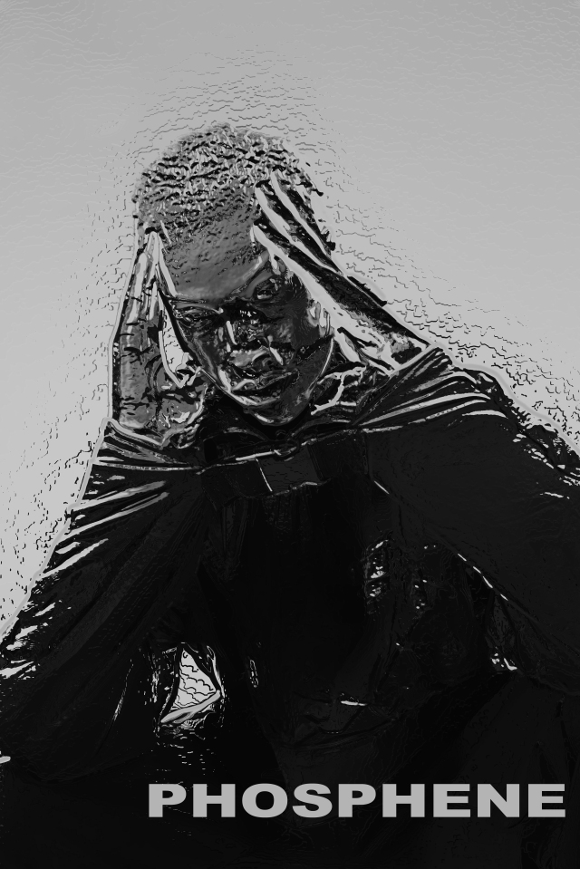
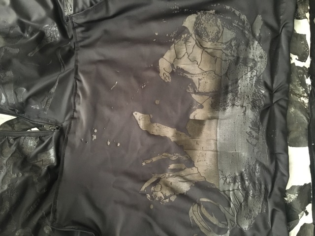
The one problem that I came across in the construction process was a confusing failure to set the left sleeve in to my garment without the lining showing through as a white line between the shoulder and sleeve. Upon unpicking this stitch and trying again, the result was the same and I felt that I wanted to use this problem to create an opportunity to add an element of branding that I was yet to include. As i had recently acquired webbing that was used to attach my quick release clips to my jacket, I used the spare material that was left over to utilise laser engraving once again, writing the word Phosphene on a panel that could cover my mistake and add an extra irregular detail to my jacket. The ending result of this was exactly the effect I had planned as an outcome of the problem and I feel that it allowed for a finishing touch to the jacket that had previously been rather plain as an all over garment.
To accompany this, I had my garment worn in a studio shoot with two separate models and created my own stylised illustrations and promotional imagery to act as supporting outcomes, relating to my pathway as I head into my Illustration degree next year. 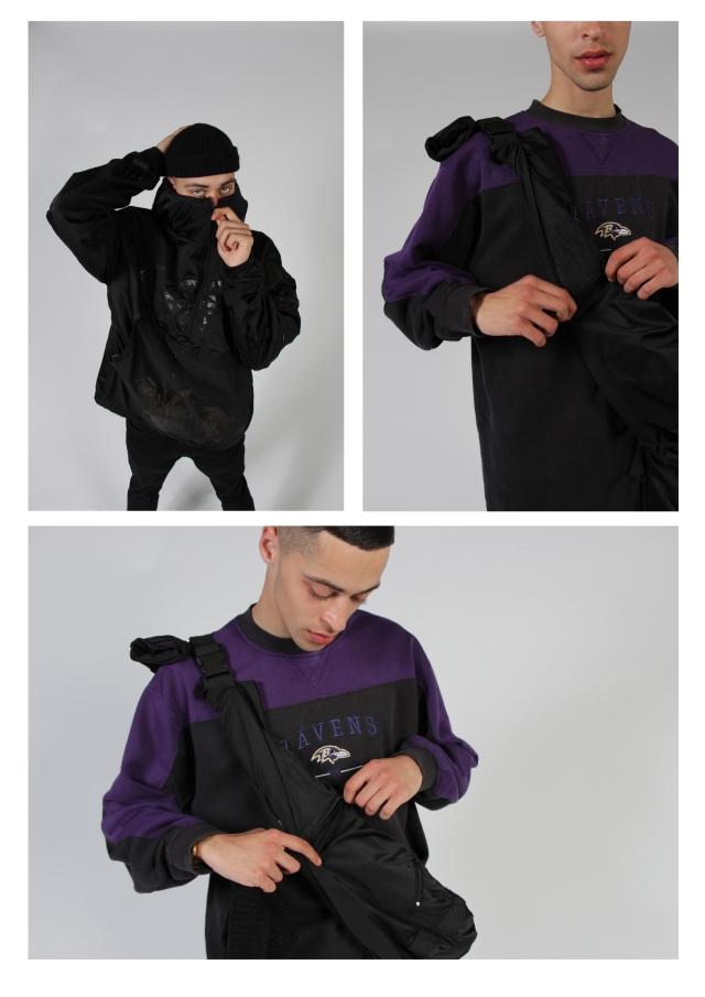


FMP – Laser Engraving
The experience of engraving my Lycra was one of learning and improvement, As my the first design that I sent through the machine was set to work at 10% of the speed that the laser cutter can achieve. This was unknown to me at first and after waiting 3 hours for this small, 20cm squared design to finish I was intent on finding a way to speed up the process and achieve the same result that despite the time, was very detailed and well done.
Returning the next day, I intended to complete two more sections of the garment by the time that prototyping closed yet was told to only increase the speed of the cutter by 10% in order to not drastically hinder the realisation of my print. This meant that the engraving process for the largest part of print on my garment still took almost 3 hours and was clearly not a viable solution to continue the final piece with. In fact, I actually preferred the finish of the front panel engraving to that of the hood, as I felt that the Lycra had a more reflective and distorted texture to it than the meticulously drawn out design that covered the hood.
In fact, when engraving the front pocket, a peer informed me that the speed of the machine could be increased whilst the job was completing and offered to set this up for me. Regretfully, I agreed to this as they accidentally restarted the printing process instead of resuming it. To resolve this problem I had to Realign where the design had got to and increase the speed to complete the design. Unfortunately this created a different colour and texture to one half of the pocket engraving, and caused the fabric to split in several parts but I felt this was not too much of an issue as I have been aiming for a confusing effect to cover my garment and if anything, this helped me portray the angle that this supported.
FMP – Finalising Print
Now I had my toil giving me more or less a representation of the shape and fit of my final garment, I used it to digitally overlay my illustrations in ways that explored composition. The kind of experimentation I tried involved using symmetry and pattern to install what were ambiguous and complicated images onto a textile with a seemingly regular look or the opposite of this, where details of the drawings that stood out could be applied in ignorance of symmetry to create further confusion and irregularity in the design. The latter was a preferable result both conceptually and aesthetically, which was extremely encouraging towards the success of my project, allowing me to generate the potential of visual anxiety whilst making intriguing and pleasant designs as well.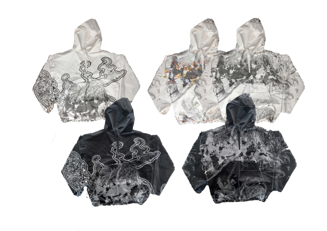
These experiments of all 4 pages of this stage were my favourite examples of the composition of my final garments laser engraving. Specifically I liked the examples that showed the phosphene illustrations seeming from the middle of the garment and sprawling out over the jacket so that the eye can follow the print from any point to another place on the body. Practically, I was aware that it would be difficult to generate a laser engraving effect that seamlessly moved across the different parts of the jacket that had been stitched together and so began to develop 6 different larger phosphene illustrations that would individually cover the pattern pieces of the garment in each their own way.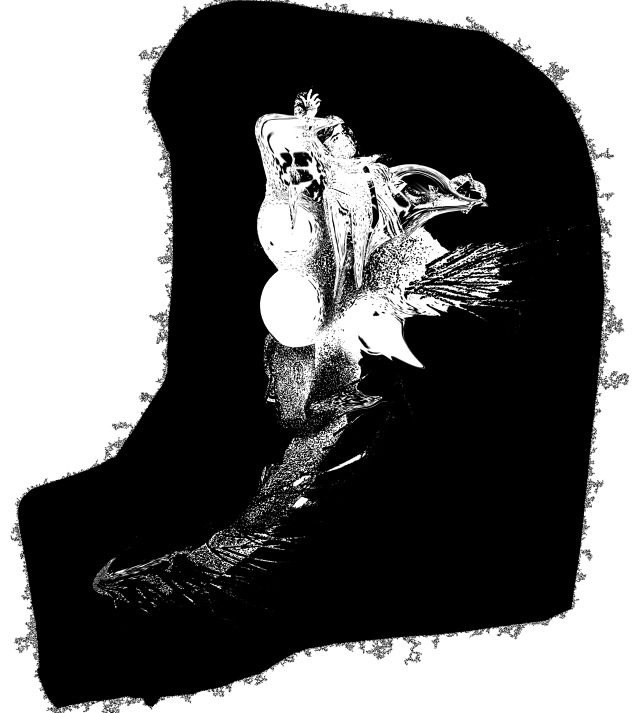
I was very pleased with the final look of these 6 images and the way that I illustrated and digitally warped them to work with the shape of the garment. I employed the most amount of processes I had to date and felt this was only right considering these would be my last pieces of non-design based artwork in my FMP. The result was one of subtlety, distortion, texture and confusion, fit with representational imagery hidden within the mark making and essence of the designs. My last steps in this developmental stage were aligning these images with the patten pieces of my garment and preparing the fabric for laser cutting.
FMP – Finalising my Design
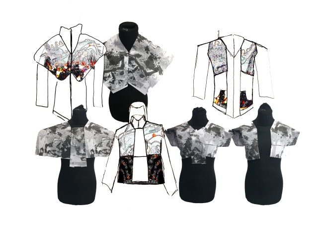
With my textile choices confirmed, I needed to decide the final design of my garment and so found a suitable male croquis that carried a good representation of the fit i was intending. From this I drew out the fit and silhouette of the garment 8 times and moved around details including pockets, zips and flaps to find the optimal arrangements of a jacket that would suit my context. The details that I found were important and helpful towards this idea involved the length of the zip and the size of the pocket in regards to the subtlety of the layer.
Two of the designs that I felt supported my concept the best were the two drawings that featured the most ambiguous pockets, with details that required some sort of action or exploration of the garment to reveal the space inside. These designs came after establishing that I would prefer the coat to feature a half-zip seal rather than a full one, in order to keep the spread of the art that covers the fabric more or less together and unbroken.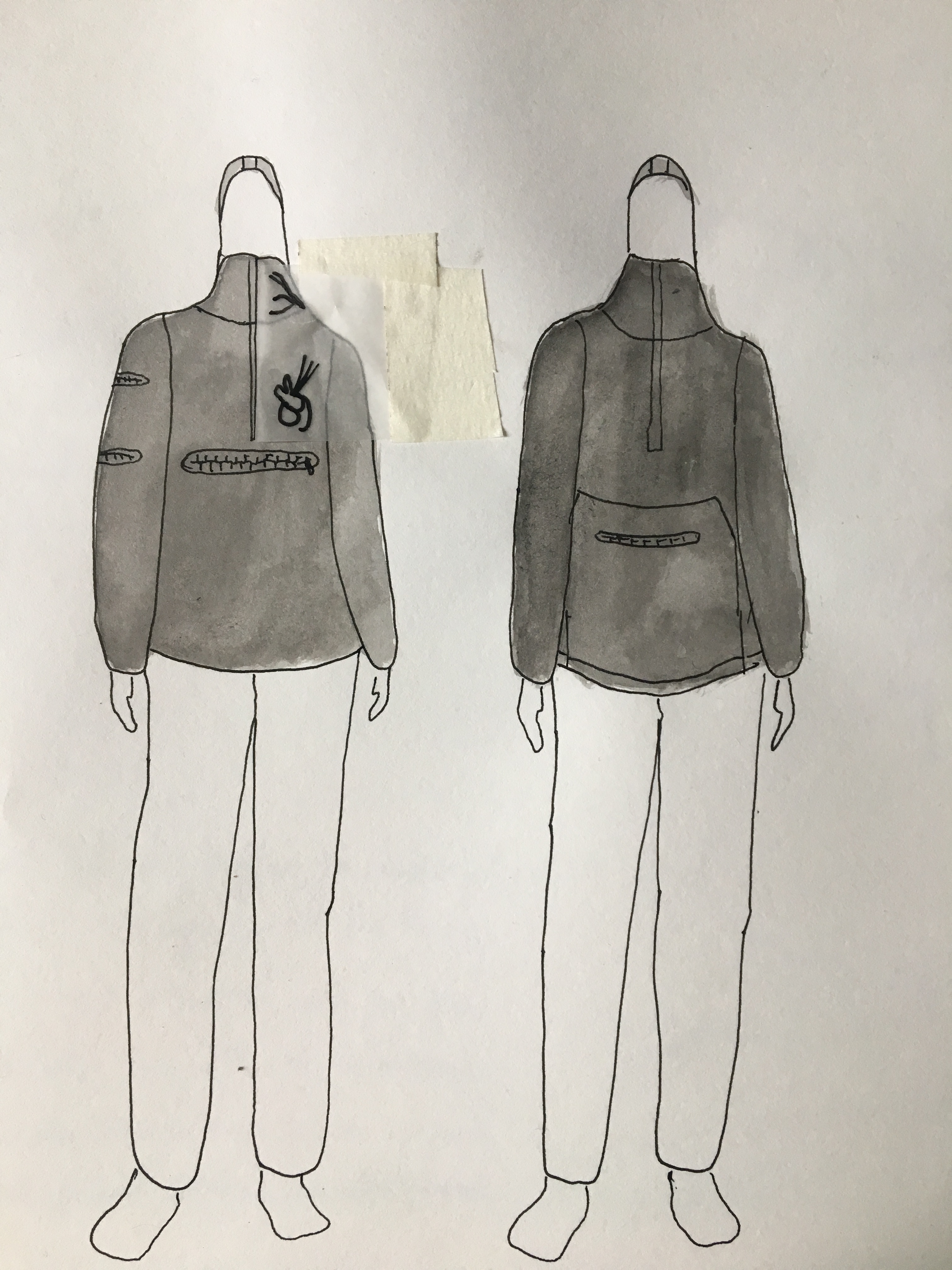
At this stage I also wanted to somewhat explore the positioning of some areas of print based on where I was already deciding for other details to go. I tended to gravitate towards following the lines of the jacket in some way to make the designs seem like they stem from a point and eventually reach another point in space. Largely however, this was unexplored as I had planned to properly investigate print after I had developed a toil.
My technical flat drawings were necessary to finalise after deciding on whether the large pocket on the front of my garment would emulate more of a curved hoodie style or a simple geometric one. My result was somewhat of a compromise, with the aim being again to create an ambiguity with regard to this detail also under the influence of wanting to maximise the size of the pocket for functionality.
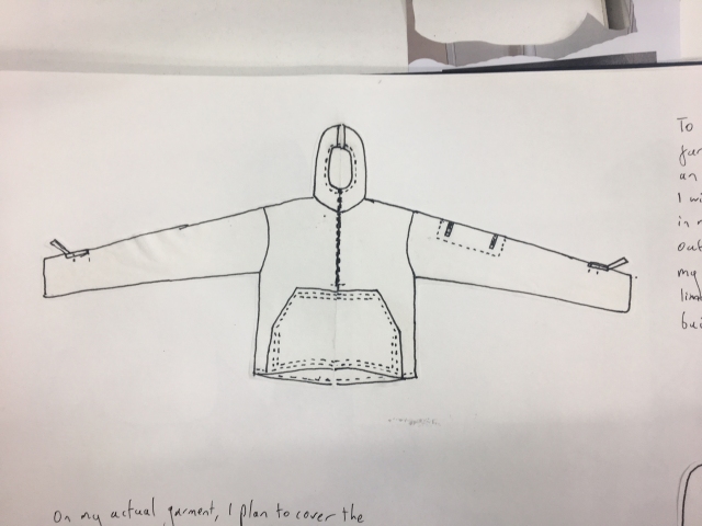
A toil could easily be created from this plan, with the pattern pieces being traced and then adapted from a windbreaker jacket that I bought. As I mentioned in my sketchbook, this Toil met almost all of my expectations and provided a good example of how I wanted my final piece to appear, despite the elasticated waistband, hood and sleeves being slightly too tight. Following this, I went back to my pattern pieces and added the necessary adaptations such as adding an extra panel to the hoodie and widening the sleeves. This would achieve the comfortability and further accentuate a loose yet constructed fit.
FMP – Sourcing Materials
Before I traveled to Shepherds Bush to source my synthetic breathable fabric that would carry my laser engraving, I drew up a list of other factors that would allow me to fully realise a successful garment in terms of my context.
This list involved these requirements:
Shiny – Insulating – Strong – Stretchy – Light – Easy to engrave – Good shape retention – Comfortability – Waterproof – Resistant to Creasing – Loose/ easy to stitch.
The samples I collected to inform my decision in the final choice of textile included PVC, Nylon, Polyester and finally Lycra. With the exception of Lycra, my other choices possessed almost all the important properties that i needed to include in the jacket and would have also been utilised in an effective way to create another jacket. However, the durability and breathability that came together with the Lycra seemed the most appealing when on a soft fabric and allowed for a lightweight outer layer. If I was intending to design a collection of garments instead of just one piece, I would most likely use the same textiles from my samples. For example, The Nylon I sampled would suit a garment with a more rigid fit and the PVC would allow for a sturdy accessory.
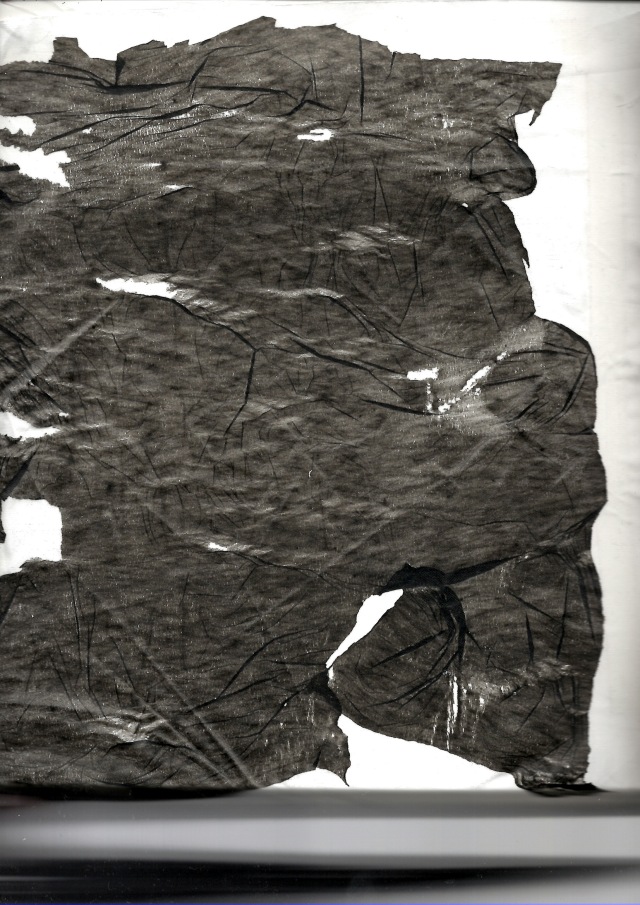
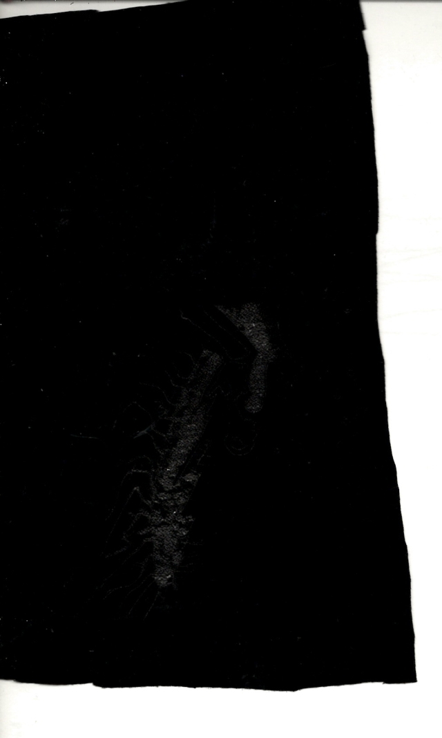
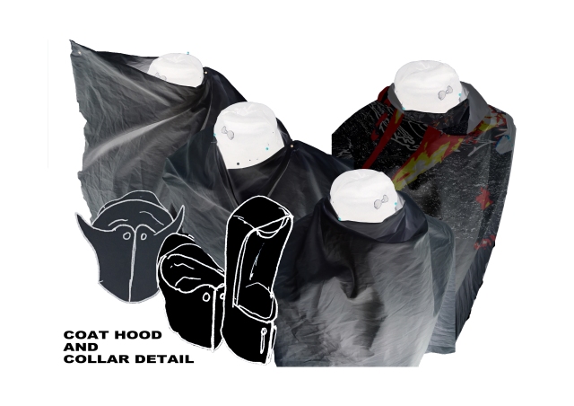
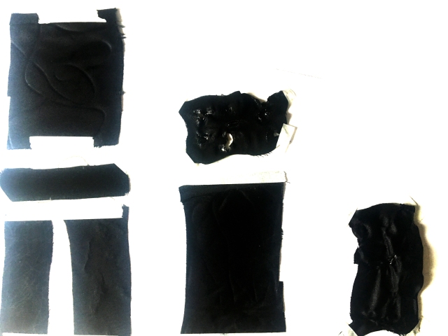
Next, I had to reintroduce, test and create my lining for the jacket that I had decided to involve the fused bin liner for. This was mainly down to the fact that with the lining of the coat, I felt I had more freedom to create an ambiguous and deeply detailed textile to support my context. The look that this bin liner effect created alongside heat-pressed phosphene illustrations that were dotted around each piece of my lining, was one of layering and randomness that once again meant it was impossible to fully complete a visual understanding of the design. Contextually as well, this lining is found hidden by an outer layer of simplified and comparatively understated fabric that alludes to the idea that the side we put out to the world as an entry point is very little of our whole self. With the way that the subtle laser engraving on the surface of my Lycra catches the light and appears to have a different texture to the rest of the textile, it will encourage those who see it to want to understand the texture of the jacket and eventually be exposed to a complexity and detail that they will not be ale to cover. In turn I hope this could inspire this action to be made towards peoples lives and personalities, encouraging at least a further look into someones life rather than a surface level judgement.
FMP – Design Development
From what I had achieved through my draping experiments and the sketches and edits I drew from this, I was able to finalise the decision of making a cropped piece of outerwear that included a number of contextual factors of design to nod to my concept in a fashion sense.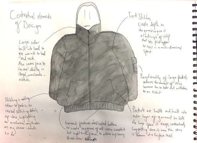
I feel that this process emulated the way I had been working for most of the project, where I produced a body of work that experimented, deviated and made solutions for my short term aims like translating photoshopped drawings into textiles for example, and then locked in this work by starting a new stage of development. These pages essentially locked in the idea that my one final garment would be a blend of fitted and relaxed silhouettes of outerwear, fit with hidden detail and functionality that allowed for comfortability and ease of use within a rave environment. Therefore, I could return to the part of my project that I feel was truly creative, and reintroduce my phosphene illustrations of my visual interpretations of personalities and the unspoken dialogue between them.
Naturally in a fashion focus this meant, fabricating my prints in differing methods once again, narrowing down the textiles I was using to suit the new designs I had created. The most effective point of these experiments involved reintroducing fused bin liner and laser engraving onto synthetic fabrics like spandex. Both of these methods gave a textural, glossy finish to what were already illustrations of depth and layering, designed to overwhelm and confuse a viewer with regard to a complete image. In fact, the more that the experiment featured ambiguity in how it turned out, the more it fitted the sentiment I used in my sketchbooks; where confusion involved the viewer in a sort of visual anxiety and frustration of not understanding exactly what they were looking at.
FMP: Designing
 Having developed multiple different fabric samples using many different processes such as digital printing, laser-cutting/engraving, fusing, distressing, burning, stretching and embroidery, I had a base of looks and patterns that could be applied to garments from the uniforms of the individuals I wanted to target. Initially this meant overlaying print experiments onto two garments that I felt provided strong staples of detail for the raver context. This was a heavy coat and fitted hoodie, that when covered in my both industrial and flowing marks, made gritty yet intricate looking garments. This excited me to move forward and prepare a set of designs that can properly work with these print ideas and also contextually nod to the silhouettes of both relaxed flowing 90s garments and these modern complicated constructions.
To reach the audience of young people that I was intent on reaching, these silhouettes were extracted from the uniform of modern and classic 90s ravers at the same time, in order to marry the free and lightweight comfort of the acid house scene with the bulky and artificial strength of grime and drum & bass lovers. Part of the functionality of this design process was providing ravers with a garment that served them with a single warm outer layer to cover a tee shirt or polo, minimising the amount of pieces of clothing that one has to take out with them into an environment that will become hot and sweaty. This garment should be warm when worn for cold, British nights yet not overwhelming to wear inside at events to an extent.
The examples of garment that I came across were hoodies or windbreaker jackets that presented both a fitted or baggy drape across the body, where the differing details of older and more modern styles could eventually be combined on a mixed silhouette.
To help realise these details I draped both existing garments, fabric and paper details on the stand in ways that would emulate an elasticated waistband, hood collar and heavy features of outerwear. The way I saw these large details creating defined shapes on garments like windbreakers did add a modernity and higher level of construction to what is usually a thin and simplistic piece. This followed on from an experiment of sketching out alternative arrangements and details of ‘hippie’ sweatshirts and modern fitted hoodies that gradually blended their separate elements to inspire what kind of shapes I wanted to create in my draping.
FMP: Mid-Point Assessment
This week was started on the tuesday with a peer assessment session, intended to give us an idea of the standard we were working at with regards to the actual marking criteria. This involved looking at the parameters that qualified for merit, pass and distinction within context, research, development of creative practise, planning, problem solving, evaluation and outcome. This let everyone readjust the way they were thinking about their work so that they were aware of what examiners were looking for in their project and not just what we wanted to see.
For me, this largely meant continuing in the direction I had just started to move in regarding fashion, developing my A3 sketchbook further and translating the 2-D experiments i had worked with onto 3-D forms like the stand or textiles. Although this was my plan for the rest of the week already, getting to see other peers’ sketchbooks in this activity meant that I was more encouraged to develop my processes further and utilise more of my sketchbook to show each small development and temporary diversion from my ideas. This would create a wealth of content to reflect on when making bigger desicions towards getting to a final outcome.
Part of this would also require the other element that was brought up in my feedback involving analysis. The specific examples that were cited mentioned pointing out and documenting failed experiments and explaining the reasons they were favoured against or developed into different outcomes. In reaction to this, I annotated earlier work in my sketchbooks with more critical looks at how certain experiments realistically supported the work that I wanted to end up with based on my proposal and the context of the project. Most importantly this refined my textiles in a way that narrowed down the eventuality of making a textile I would be unlikely to really use. Objectively, this surrounded dark colours, recognisable human imagery, detailed mark making and irregularity in pattern that should all combine to produce a fabric that is fascinating to view in completion but limited at a distance or at face value.
FMP: Moving towards fashion focus
 My first movements in starting the larger, A3 fashion sketchbook was creating a wealth of fabric samples to document; with a growing visual narrative throughout. I wanted to group certain experiments together, displaying what kind of textures and references I was attempting to re-create and also likening certain materials and effects to the work of designers that had inspired me in previous projects.
One of the main examples here was Balmain, which as a brand has always caused me to think of the textiles and the garments of another place, resembling the real world but through a stylised window. For example Ss 17 creates a void like space inside its garments, with thin, soft blurring of the models skin and fragmented, irregular textures cladding the outside of the body. In many ways this resembles my illustrations in how they become soft and curved at points yet harden and become rough at others irregularly as to form complicated, multifaceted perosnalities or detailed and varied garments. Across different collections, Balmain seems to take this idea and output it as if coming from different worlds in every new collection, built from different materials and elements. This seems like a good foundation to base the designing of a garment around, connoting that people within a group or demographic can actually stem from different backgrounds yet be connected by a shared goal. Also, as I begin to research my intended target audience of young people engaged in music and art, I realised the diversity of fashion that can exist in these groups.
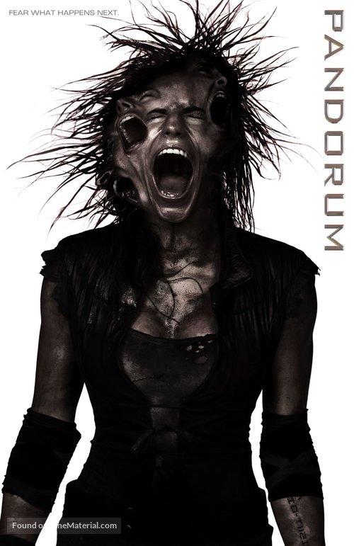
Then, on an entirely contrasting note, I wanted to research the costume design of the film ‘Pandorum’ which I have recently found visual connections to within my work. Essentially, the iratic, depraved and insane race of characters that is effected by extreme paranoia whilst trapped in space, linked to my visual depictions of anxiety and mental illness in its jagged and decayed aesthetic. I feel that if these characters represent the rejection of sane humanity, then their appearance can be looked at as the raw chaos of the human mind. Therefore, the cloth rags and splintering metal of their costuming becomes significant to the depiction of a personality and a mental state, by acting as the extreme case of what I’m looking at. It was in fact these visuals inspired by the film that caused me to test he effect of heat pressing and stretching bin liner and black plastic, so that it resembled these glossy and deconstructed looks.